So, some of you may know that I'm building a Grid control for our MG-ALFA application. We started by looking at the WPF grids out there, and found that none of them really fit our needs. There were several issues with the controls on the market. Much of what we wanted was very 'simple', as far as look & feel (like a traditional grid), yet all the WPF grids on the market seemed to be focused on 'pretty'. Also, we needed to be able to customize several very specific features - for instance, we wanted dragging of columns for reordering, fixed rows & columns, and the ability to easily transpose the grid.
None of these features were easy to come by in existing controls, and in order to get an of them, we would have to heavily customize the controls out of the box. The customization would be 'on top' of the control, so there wasn't a good way to tie it to our data model, and transpose was the killer feature. In order to get transpose, we would have had to write some really nasty code and do some really unpleasant things with databinding. If we didn't do those nasty things, we'd have to use 'unbound' mode on the controls, which would lead to really unpleasant code to keep the grid in sync with the data changes.
Finally, after a ton of investigation, we decided we'd be better off just writing our own control and building a truly custom data model for the grid, rather than trying to force fit an existing control to our problem. We were very skeptical about the amount of time it would take to build a grid that had the features we needed, but I was pretty sure it would be less than a few weeks, and it turns out I was mostly right about that. I'm going to try to describe the design of the control, from the ground up, in a series of blog posts, but I hope you'll ask questions if you want more details, as I undoubtedly won't cover everything.
So, first, let's talk about the basic design of the grid, and the features we required. The grid is built on WPF mostly using visual layer programming to do the rendering. It supports fixed rows, fixed columns, and has row and column headings. Visually it looks very much like MS Excel. The UX is also intended to be very much like Excel, except with some modifications that are specific to our domain needs (and no support for formulas).
What to derive from?
The first decision in any custom control development for WPF is to decide which of the multitude of classes you should derive from. The class hierarchy is:
Visual
UIElement
FrameworkElement
Control
...
Visual is very rudimentary, and basically provides only the ability to manage and participate in the visual tree. It is possible to build components at the 'Visual' level, but relatively difficult, and they must be built from other components that are at a higher level (at least UIElement). This is because the only thing a Visual can effectively do is contain other Visuals, and perform hit testing. There are a few Visual-derived classes that can be used by control designers (DrawingVisual, ContainerVisual), but these aren't really useful as base classes (maybe ContainerVisual, but certainly not DrawingVisual).
UIElement is effectively the lowest level class that a control designer might want to derive from. It provides basic layout, event handling, focus support, and rendering features. To provide code for rendering a UIElement, you must override OnRender. You also will want to override MeasureCore and ArrangeCore to participate in the layout process. You may also want to override HitTestCore to provide sophisticated hit testing for your control, especially if you have a non-rectangular area (our control will be rectangular and covered by other child controls, so we don't really need to mess with HitTestCore).
FrameworkElement is really the 'entry point' into WPF framework-level programming. Much of the core functionality for rendering is introduced in the UIElement class, but FrameworkElement builds on these features and provides some core implementation that makes it easier for you to implement the layout methods (i.e. it handles things like HorizontalAlignment, VerticalAlignment, Width, Height, etc., so you don't have to write the tedious code to make these work in your MeasureCore and ArrangeCore implementations). It also provides the core functionality needed for data binding. We'll derive our grid control from FrameworkElement, because it's the lowest class we can derive from without making a ton of extra work for ourselves, and it's the highest class we can effectively derive from without introducing features we don't want.
Control introduces style and templating support. Since we specifically don't want the XAML user to be able to customize the control template and styles for our grid (we want very specific control over how things are rendered), and don't need the flexibility that styles and templates provide, we don't want Control. However, it should be noted that if you want to build the 'best' control, from a flexibility standpoint, you probably do want to provide these features and use the 'recommended' approach of deriving from something at the Control or higher levels of the inheritance tree.
Visual Layout
Our grid control looks like the screenshot below (currently). It is still a work in progress, and that's why those ugly orange sections are there, and why the fixed rows look kinda funny (no gridlines, green background, etc.).
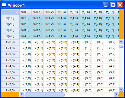
Obviously the data I've been working with is dummy data, generated by my data source for my benefit during development.
My first step in building the control was to design the layout of the control, in terms of separate 'regions' of the grid, based on their scrolling nature, and based on the relative positions of the scrolling regions. In the picture below, I've labeled the 9 independent regions of the grid control.
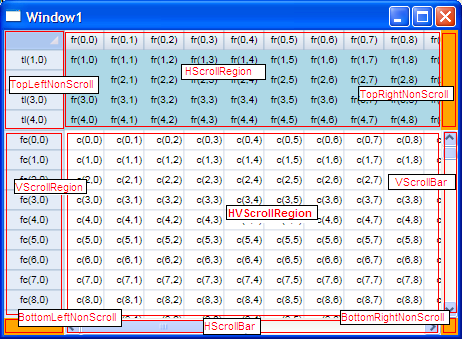
The regions, in left-to-right (top-to-bottom) order are:
- TopLeftNonScroll - the fixed row/fixed column intersection, including the "select all" box.
- HScrollRegion - the horizontal-only scrolling region (fixed rows, scrolling columns).
- TopRightNonScroll - the area above the vertical scroll bar, that doesn't scroll and will eventually house buttons or some other visual cue / support.
- VScrollRegion - the vertical-only scrolling region (fixed columns, scrolling rows).
- HVScrollRegion - the 'data' section of the grid. This area scrolls both directions, and is made up of the scrolling rows / scrolling columns intersection.
- VScrollBar - the vertical scroll bar (a ScrollBar control with its Orientation set to Orientation.Vertical)
- BottomLeftNonScroll - the non scrolling area to the left of the horizontal scroll bar, will eventually be another place for buttons, etc.
- HScrollBar - the horizontal scroll bar (a ScrollBar control with its Orientation set to Orientation.Horizontal).
- BottomRightNonScroll - this will likely just be a gray 'dead-zone' so the scroll bars don't look stupid.
For the most part, except for scrolling, the HScrollRegion, TopLeftNonScroll, VScrollRegion, and HVScrollRegion have the same UI / UX, so I've combined much of the functionality into a single base class called "GridRegion". It has some parameterized options (like which directions it can scroll), but for the most part the code is all shared and used from this class. The derived classes are generally pretty small, and are just responsible for 'customizing' the GridRegion functionality.
The other regions are currently implemented just as canvases (except the ScrollBars, of course).
Data Binding model
My data binding model has several parts. The entire model is really a 'view' from the standpoint of MVP-like design patterns (at least in my assessment it is). The real data model is specific to the application. The Data Binding model supported by the grid has bindings for the selection and active / anchor cells, the row & column sizes, and the contents of the cells (including render flags and other special items).
In order to simplify the design and implementation, I've separated the binding into several objects based on the way the regions break up the grid. The major breakdown is between dimension metrics, render info, and selection support.
Dimension Metrics (sizes of rows / columns)
For the dimensions of the rows and columns, I've defined an interface called IDimensionMetrics that allows management of and provides information about the sizes of rows or columns. It is defined as follows.
public interface IDimensionMetrics
{
    double GetSpace(int index);
    void SetSpace(int index, double space);
    double GetStart(int index);
    double TotalSpace { get; }
    int Count { get; }

    event EventHandler SpaceChanged;
}
Each object that implements IDimensionMetrics only represents a single group of rows or columns. There are 4 implementations of IDimensionMetrics for a single set of grid bindings. The columns are broken into "fixed" and "scrolling", as are the rows (for a total of 4 separate groups).
In order to provide some additional features for IDimensionMetrics without requiring that all implementers implement these features, I've used some extension methods to implement common algorithms based on IDimensionMetrics. The extension class is as follows.
internal static class DimensionExtensions
{
    public static double GetEnd(this IDimensionMetrics metrics, int index)
    {
        return metrics.GetStart(index) + metrics.GetSpace(index);
    }

    public static int HitTestNoSizing(this IDimensionMetrics metrics, double v)
    {
        for (int i = 0; i < metrics.Count; i++)
        {
            double ofs = v - metrics.GetStart(i);
            if (ofs >= 0 && ofs <= metrics.GetSpace(i))
                return i;
        }
        return -1;
    }

    public static int HitTestWithSizing(this IDimensionMetrics metrics, double v, out bool overSizingGrip)
    {
        for (int i = 0; i < metrics.Count; i++)
        {
            double ofs = v - metrics.GetStart(i);
            double space = metrics.GetSpace(i);
            if (ofs.InNeighborhood(space, 3))
            {
                overSizingGrip = true;
                return i;
            }
            else if (ofs.InBetween(0, space, DoubleExtensions.EndpointInclusionMode.LeftInclusive))
            {
                overSizingGrip = false;
                return i;
            }
        }
        overSizingGrip = false;
        return -1;
    }

    private delegate Rect CVR_GetRect();
    private delegate void CVR_UpdateRect(double space);

    public static void ComputeVisibleRange(this IDimensionMetrics metrics, Rect visibleRect, Direction direction, out int first, out int second)
    {
        if(direction != Direction.Horizontal && direction != Direction.Vertical)
            throw new ArgumentException("direction must be horizontal (columns) or vertical (rows)", "direction");

        int min = metrics.Count;
        int max = -1;

        var initializeRect = direction == Direction.Vertical ?
            (CVR_GetRect)(() => new Rect(visibleRect.Left, 0, visibleRect.Width, 0))
            : (CVR_GetRect)(() => new Rect(0, visibleRect.Top, 0, visibleRect.Height));

        Rect rngRect = initializeRect();

        var updateRectSize = direction == Direction.Vertical ?
            (CVR_UpdateRect)((double space) => rngRect.Height = space)
            : (CVR_UpdateRect)((double space) => rngRect.Width = space);

        var updateRectPos = direction == Direction.Vertical ?
            (CVR_UpdateRect)((double space) => rngRect.Y += space)
            : (CVR_UpdateRect)((double space) => rngRect.X += space);

        for (int i = 0; i < metrics.Count; i++)
        {
            double space = metrics.GetSpace(i);
            updateRectSize(space);

            if (rngRect.IntersectsWith(visibleRect))
            {
                min = Math.Min(i, min);
                max = Math.Max(i, max);
            }

            updateRectPos(space);
        }

        first = min;
        second = max;
    }
}
In IDimensionMetrics, GetStart gives the starting position of a row or column, and GetSpace gives the space that it occupies. The extension method GetEnd returns the result of GetStart + GetSpace for a given column. TotalSpace is the sum of all GetSpace values for all rows/columns in the IDimensionMetrics. It could have also been computed as an extension method, but I decided it would be better as a property so that the IDimensionMetrics implementer could precompute it.
The HitTestNoSizing and HitTestWithSizing extension methods help determine which column or row a given point is over (for mouse hit testing). The former ignores sizing grips, while the latter will indicate the proper position for a sizing grip (currently hardcoded to a neighborhood of 3 device-independent pixels on each side of the sizing line).
Selection Info
First of all, my grid only supports selection of rows / columns / cells in the scrolling area of the grid. For that reason, I have a single SelectionInfo binding for all regions, and the columns / rows used by the SelectionInfo members (FirstCol, FirstRow, LastCol, LastRow, etc.) are relative to the top left corner of the data region (HVScrollRegion). If I needed support for selecting within the fixed rows and columns, then there would be some additional complexity in my code but it could be supported. I think of the fixed rows and fixed columns as essentially being 'extended' headers, so it doesn't make sense to select them, or have an active cell in these regions (just as it doesn't make sense to be able to make the active cell be the 'C' header in the C column of Excel!).
As with my other stuff, selection info has an interface that exposes the functionality required by the system - ISelectionInfo, defined as follows.
public enum SelectionType
{
    None,
    Rows,
    Columns,
    Cells,
    All,
}

public interface ISelectionInfo
{
    SelectionType SelectionType { get; }
    int FirstRow { get; }
    int FirstCol { get; }
    int LastRow { get; }
    int LastCol { get; }

    int AnchorRow { get; }
    int AnchorCol { get; }

    int ActiveRow { get; }
    int ActiveCol { get; }

    void SelectColumn(int column, bool extend);
    void SelectRow(int row, bool extend);
    void SelectCell(int row, int column, bool extend);
    void SelectAll();
    void Clear();

    int MaxRow { get; }
    int MaxCol { get; }

    event EventHandler SelectionChanged;
}
I'm still not sure whether this interface will remain the same forever, I might change it to act more like Excel (i.e. removing the distinction of SelectionType and just making the different selection rendering be handled by comparing FirstRow/FirstCol with 0, and LastRow/LastCol with MaxRow/MaxCol). The interface is pretty self-explanatory, except for AnchorXXX and ActiveXXX. ActiveXXX is used to track where the keyboard has you on a keyboard-based selection extension (i.e. you hold shift and move around with the keyboard). AnchorXXX is used to track the starting cell for the selection. When moving away from a selection (without the shift key held), AnchorXXX is the position from which you start. This is counterintuitive to me, but it's how Excel works so I've replicated it.
Notice that ISelectionInfo is just the 'keeper' of the selection, and provides some methods for modifying the selection, but it doesn't have anything to do with the keyboard or the mouse. The support for modifying the selection via keyboard or mouse is isolated in the KeyboardManager and MouseManager classes, discussed in a later post from this series.
Render Info
Within each of the regions, we need to be able to obtain and change the cell text, get the render flags (i.e. is it selected, is it a special cell, etc.), get the text alignment, and some other special info for the grid region. The interfaces involved are IRenderInfo and IButtonInfo. The applicable definitions are as follows.
[Flags]
public enum CellRenderFlags
{
    None = 0,
    TopLeft = 1,
    ColHeader = 2,
    RowHeader = 4,
    FixedCol = 8,
    FixedRow = 16,
    Active = 32,
    Selected = 64,
    Hover = 128,
    Anchor = 256,
}

static class CellRenderFlagsExtensions
{
    public static bool Contains(this CellRenderFlags target, CellRenderFlags flag)
    {
        return (target & flag) == flag;
    }
}


public interface IRegionRenderInfo
{
    CellRenderFlags GetCellFlags(int row, int col);
    string GetCellText(int row, int col);
    void SetCellText(int row, int col, string text);
    TextAlignment GetTextAlignment(int row, int col);

    Orientation ButtonOrientation { get; }
    IButtonInfo GetButtonInfo(int index);
    int ButtonCount { get; }

    event EventHandler ResetRenderInfo;
}

public interface IButtonInfo
{
    ... <removed for brevity> ...
}
We will ignore IButtonInfo and the associated bits from the IRenderInfo interface for now and focus on the other IRenderInfo information. The cell render flags are various pieces of info that allow the CellRenderer class (discussed in a later post) to do its work. The CellRenderer also needs to know the text alignment for the cell and the cell text itself. The SetCellText method is provided for the in-place editor that allows modification of the cell text.
This concludes our discussion of the data binding interfaces used by the grid.
No comments:
Post a Comment